


Questions regarding Font and UI Scaling
Moderator: MOD_DW2
-
Mightymaster
- Posts: 40
- Joined: Wed Jan 19, 2022 1:56 pm
RE: Questions regarding Font and UI Scaling
I have to admit that in the different streams sometimes its hard to read but here in the screenshots shown by Erik I have no problem with the grey text. Should be even better when ingame.
RE: Questions regarding Font and UI Scaling
ORIGINAL: Erik Rutins
Your screenshot looks a bit more dark and gray than mine, so I would assume that's a function of the stream you got it from somehow. The screenshots above are accurate to the game. With all that said, we may add something to the settings before release to let people increase the text contrast more if they wish. That shouldn't be too hard.
Thank you for considering this! Maybe the ability to change the font color or at least mod it somehow?
RE: Questions regarding Font and UI Scaling
ME LIKE.
Looks wonderful.
Looks wonderful.

RE: Questions regarding Font and UI Scaling
I have to agree the UI looks very good and is very good in adapting to the different size of the text and the room that is there and how it is filled out with the windows.
I have nothing to complain about!
But as a side note, I want to mention that it would be very good, if we could change the font just as we wish.
I know the problem in DW could not be solved as lets say in MOO3.
There it was possible to change the font and the scaling by giving the game other ttfs.
I worked on that fonts for a long time, and got some fonts I prefered.
Maybe you know what I am talking about.
In the fonts.txt one could change the ttf fonts:
So I used for instance the isocpeur.ttf and had a better looking font than the original.
Unfortunately, the UI itself was not always using the fonts as declared, so some titles were not used, others were, lets say in the help-overlay hardly readable.
But this is, what would be nice if used throughout the game:
for big title, medium title, small title, description, help text.. and so on. Also the colour.
We could choose on our own which font to use. With files as .ttf, .otf, woff or whatever, but please do not compile it somehow with some microsoft thingy that it can never be changed later..
I hope you know what I mean and that are my 2 cents.
Thanks for reading
fred
P.S.: Please do not forget the colorblind! (Maybe somewhere you mentioned already that you have an option to address this?)
And please do not use red text on blue background or vice versa.
P.P.S.: The uploaded picture shows the original on top, the changed fonts at the bottom.
You can see here very clearly, that size does not always matter. The smaller font (in this case isocpeur/courier) is better readable than the bold condensed with the even worse "always-capital-letter" font. This is not shown in thise screenshot. Saying it out of my memory. Somewhere is it always captial but a font was able to circumvent it (I think).

I have nothing to complain about!
But as a side note, I want to mention that it would be very good, if we could change the font just as we wish.
I know the problem in DW could not be solved as lets say in MOO3.
There it was possible to change the font and the scaling by giving the game other ttfs.
I worked on that fonts for a long time, and got some fonts I prefered.
Maybe you know what I am talking about.
In the fonts.txt one could change the ttf fonts:
Code: Select all
tt0047m_.ttf
 isocpeur.ttf
 cour.ttf
 isocpeur.ttf
 tt0009m.ttf

 OS	Verdana
 OS	Eurostile Bold Condensed
 OP	Eurostile Bold Extended #2
 OP	Eurostile Extended #2
 OM	Eurostile Bold Extended 2
 OM	Eurostile Extended 2
OS Eurostile CondensedUnfortunately, the UI itself was not always using the fonts as declared, so some titles were not used, others were, lets say in the help-overlay hardly readable.
But this is, what would be nice if used throughout the game:
for big title, medium title, small title, description, help text.. and so on. Also the colour.
We could choose on our own which font to use. With files as .ttf, .otf, woff or whatever, but please do not compile it somehow with some microsoft thingy that it can never be changed later..
I hope you know what I mean and that are my 2 cents.
Thanks for reading
fred
P.S.: Please do not forget the colorblind! (Maybe somewhere you mentioned already that you have an option to address this?)
And please do not use red text on blue background or vice versa.
P.P.S.: The uploaded picture shows the original on top, the changed fonts at the bottom.
You can see here very clearly, that size does not always matter. The smaller font (in this case isocpeur/courier) is better readable than the bold condensed with the even worse "always-capital-letter" font. This is not shown in thise screenshot. Saying it out of my memory. Somewhere is it always captial but a font was able to circumvent it (I think).
- Attachments
-
- beispiel.jpg (134.95 KiB) Viewed 2022 times
-
SirHoraceHarkness

- Posts: 522
- Joined: Sun May 17, 2015 5:29 pm
RE: Questions regarding Font and UI Scaling
ORIGINAL: Erik Rutins
I should also note that for those that prefer a larger UI but want more to fit on the lists, we also have a setting that allows a separate scaling setting for the lists vs the rest of the UI. For those with great eyesight, you can also scale the UI down.
Ah sweet! This is going to go very well with my 58" 4k screen. One of the issues I have with ui scaling is that its typically all or nothing and this little bit of customization will allow for much better access to info on a given data screen. This was a huge issue with DWU as sometimes it just couldn't fit all the info into a window and it was cut off.
Intel i9 11900k all core oc@5.3 - 32gb Crucial Ballistix 3600 DDR4 CL16 - EVGA RTX 3090 24gb FTW3 Ultra - MSI Z490 A-PRO Mobo
Re: Questions regarding Font and UI Scaling
My 2c...
I don't understand why the font isn't replaceable.
In a game where you're constantly reading stats and information, the player can't choose a font that they find more legible and/or appealing than the default?
I can't see any logic behind this decision, at all.
I don't understand why the font isn't replaceable.
In a game where you're constantly reading stats and information, the player can't choose a font that they find more legible and/or appealing than the default?
I can't see any logic behind this decision, at all.
Re: Questions regarding Font and UI Scaling
I can not find the place where it is mentioned that the font is not replaceable.Kaiji wrote: ↑Fri Mar 11, 2022 8:50 am My 2c...
I don't understand why the font isn't replaceable.
In a game where you're constantly reading stats and information, the player can't choose a font that they find more legible and/or appealing than the default?
I can't see any logic behind this decision, at all.
I would love to change the font.
This would be now one of my wishes that in my eyes could be really easy be solved.
I can explain this a little more in detail.
But before that, I would like to explain what I did in the game right now:
I was going to find out, what between upgrading of a research station has been made better.. I am changing between Version 4 and 3 of the research station but could not find anything that has been changed. It would be great if in the design screen (overview) we could see a comparison or have an adjustable table, so we could see for instance firepower or energy consumption, number of built in components and so on.
Think about it just like in an email program where you can use the field chooser and select what you want to see in the table - the size of the email or the attachment or whatever.
- fieldchooser.jpg (52.8 KiB) Viewed 2283 times
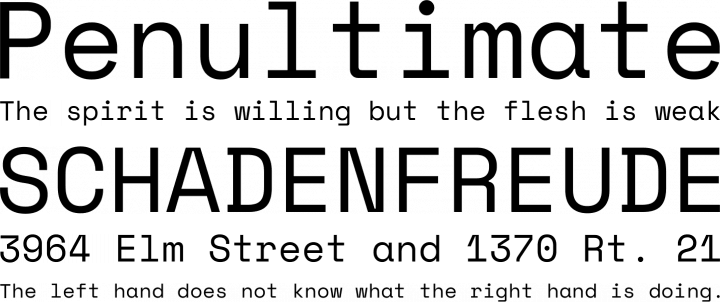
and before even this would come in handy, a font would come in handy, that is not jumping around in the width.
so there are fonts, that do not flatter around.
if you take the inbuilt font and write
0.000 and write
1.111 under it, you will see that it has NOT the same width.
And that makes it for the first glimpse hard to say which ship for instance is more expensive.
if you have one that costs 1000 and the other 1111, it appears as if the one for 1000 is more expensive, because the font make it broader.
I would love to see all those numbers nice under another.
To show it instead of writing more about it, there is a screenshot that explains it without any more words.
So again, TLDR:
Is there a way to change the font?
- flatteringFont2.jpg (78.04 KiB) Viewed 2286 times
-
eddieballgame
- Posts: 881
- Joined: Wed Jun 29, 2011 2:50 am
Re: Questions regarding Font and UI Scaling
Thank you for the UI Scaling option...that actually works.
This, alone, is a huge improvement over DW1...to include everything else.
This, alone, is a huge improvement over DW1...to include everything else.
Re: Questions regarding Font and UI Scaling
Sure is that one of the best accomplishements.eddieballgame wrote: ↑Fri Mar 11, 2022 7:39 pm Thank you for the UI Scaling option...that actually works.
This, alone, is a huge improvement over DW1...to include everything else.
Now with the new graphic, and a DW2 that is slowly going to work as DW1 with all additions works today, it will be much fun to play for years and decades!
but right now, slowly but steay, all those tiny things like I mentioned above, should be addressed.
if it is not chnaged in a good way, alsways trying to get it better, someday it is forgotten and still in that way.
So lets try to polish it to a diamond.
in DW1 many things were written in stone (because it was coded in a way that made it difficult to change certain things, but that hopefully is now overhauled) and therefore many things should be more easy to fix/adapt/chang/switchable.
Re: RE: Questions regarding Font and UI Scaling
Speaking as a person who has played DW from the very beginning, and one who has developed severe sight degradation over the years, I can state with complete confidence that DW2 is vastly improved with regards to the UI and fonts over it's predecessor.Erik Rutins wrote: ↑Thu Jan 27, 2022 2:40 am Have a look back at the Distant Worlds: Universe screenshot in the first post and I think you'll see that we've done a lot to address the scaling and font size concerns from DW1.
I should also note that for those that prefer a larger UI but want more to fit on the lists, we also have a setting that allows a separate scaling setting for the lists vs the rest of the UI. For those with great eyesight, you can also scale the UI down. Here's an example of the standard setting with smaller list scaling:

I can't thank the developers enough for the work done in this area. This has always been my favorite 4x space game and I can play it without worrying about about straining my eyes or employing a magnifier.
Thank you so much!

Re: Questions regarding Font and UI Scaling
Color matters, too. Who shall be able to read this 
There are plenty of fonts out there with borders. If you take a very close look you may notice the dark shadow which is used in this case. While shadow is a good thing in general, a dark font color on dark background with a dark shadow... well, I guess you see what I mean...
There are plenty of fonts out there with borders. If you take a very close look you may notice the dark shadow which is used in this case. While shadow is a good thing in general, a dark font color on dark background with a dark shadow... well, I guess you see what I mean...
- Attachments
-
- image_2022-05-02_164958557.png (34.83 KiB) Viewed 1777 times
Re: Questions regarding Font and UI Scaling
Not sure if this was addressed before but anyway one thing i am noticing now is that the scaling and blurriness of the fonts has a massive difference if you play on your window resolution or not.
Windows Resolution of 3840x2400 and playing the game in 1920x1080 i have fonts that are very blurry
If instead i change my windows resolution to 1920x1080 and play the game in 1920x1080 the fonts are very sharp
Windows Resolution of 3840x2400 and playing the game in 1920x1080 i have fonts that are very blurry
If instead i change my windows resolution to 1920x1080 and play the game in 1920x1080 the fonts are very sharp

Re: Questions regarding Font and UI Scaling
+1 for using monospace font in the game.
Re: Questions regarding Font and UI Scaling
I think the space mono font would be nice, it has an open font license:
https://www.fontsquirrel.com/fonts/space-mono

https://www.fontsquirrel.com/fonts/space-mono
 Re: Questions regarding Font and UI Scaling
Thanks for the very large font (the biggest one)!
The game becomes much more enjoyable when I can read text easily.
The game becomes much more enjoyable when I can read text easily.
Re: Questions regarding Font and UI Scaling
edited the post - i was rude. waiting for better dw2 days..
-
StormingKiwi
- Posts: 278
- Joined: Thu Feb 11, 2021 6:35 am
Re: Questions regarding Font and UI Scaling
UI Scaling needs work.
1) Independent colonies with lots of stuff on them (primarily colonies that swapped empires to independents after rebellions) don't have enough space in the selection panel to display the colony ship's success chance in 1080p high resolution.
2) The game confuses resolution with screen size when using the scale UI.
E.g., these are two 1920x1080 resolution screenshots, taken on a 16" inch monitor and a 24" inch monitor.
The difference between these is almost undetectable to me. I do think the 16-inch monitor has better picture quality (2937 pixels per square centimetre, compared to 1305)
However, the display is physically too small for me to read comfortably. 11-point font is 0.2 cm high on a 16" screen, but 0.5cm high on a 24" screen.
1) Independent colonies with lots of stuff on them (primarily colonies that swapped empires to independents after rebellions) don't have enough space in the selection panel to display the colony ship's success chance in 1080p high resolution.
2) The game confuses resolution with screen size when using the scale UI.
E.g., these are two 1920x1080 resolution screenshots, taken on a 16" inch monitor and a 24" inch monitor.
- 16 1920 x 1080 Small UI.png (1.18 MiB) Viewed 1005 times
- 24 1920 x 1080 Small UI.png (1.17 MiB) Viewed 1005 times
However, the display is physically too small for me to read comfortably. 11-point font is 0.2 cm high on a 16" screen, but 0.5cm high on a 24" screen.