Published on March 02, 2018
It turns out that not much has changed over the course of 20 years, with UIs still relying on the same old tropes.
We tried to shake that up a bit, asking ourselves at every corner “is this necessary? could this be done better?”.
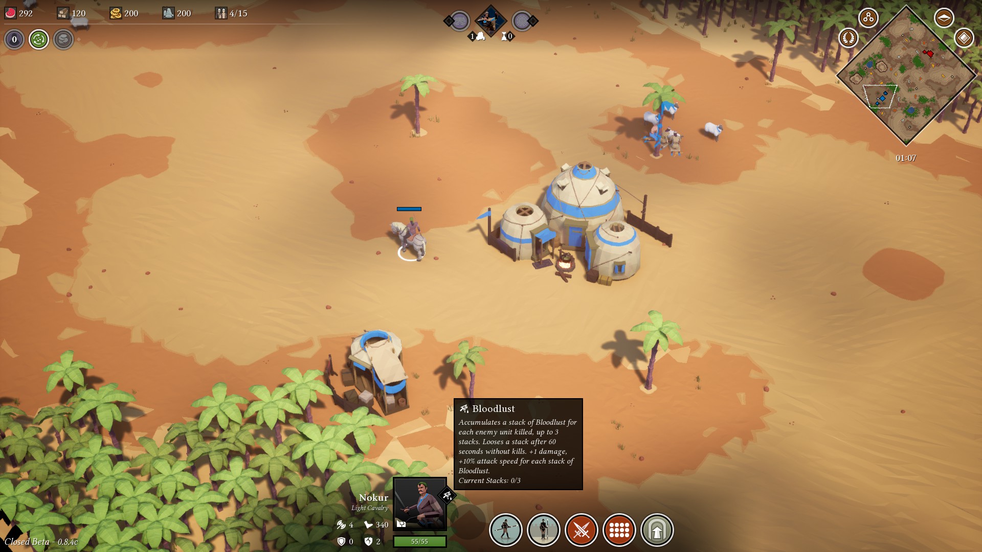
Cleanliness, consistency and ease of use were our main focuses when developing the UI. We try, at all times, to display only the relevant informations to the player - hiding the rest. Everything that is “clickable” has a white stroke around it and all the buttons are circular. Everything that simply provides informations is squared and has a black border around it.
Animations are kept to a minimum and a great effort has been given to making the UI responsive and intuitive. It is a minimalistic style which doesn’t sacrifice gameplay on the altar of eye-candy!
The golden ratio is present throughout the UI and this provides a sense of elegance and cohesion to all the elements. We think the overall result is very sleek.
We are continuously improving and evolving the UI based on player feedback. Some changes are right around the corner, stay tuned to know more!


