The maps are dated - fix the terrain

World in Flames is the computer version of Australian Design Group classic board game. World In Flames is a highly detailed game covering the both Europe and Pacific Theaters of Operations during World War II. If you want grand strategy this game is for you.

Moderator: Shannon V. OKeets

User avatar
Redmarkus5
Posts: 4454
Joined: Sat Dec 01, 2007 1:59 pm
Location: 0.00

RE: The maps are dated - fix the terrain

Post by Redmarkus5 »

ORIGINAL: bretg80

Sorry guys, I just have to say this, the terrain textures on the maps are BORING. Come'on, it's 2011 and you probably won't finish this game for a while, so in the mean time please revamp the terrain textures so that they at least look like something we would expect to see in this decade.

For example: Mtn hexes look like mud (where are the snowcapped peaks?)
Where are the beaches on land/sea hexes?
Sand hexes look like tan blah - how bout some dunes
Weather symbology obscures the map, why not use some transparency and clouds to indicate weather or
use transparency and weather symbology.

From what I've seen in the AAR, the global high level summary map looks like something right out of the 1980's . Whaz up with that?

I know, it's a harsh critique, but not undeserved. Hire a texture dude and have him fix them up. It'll make the game a lot more enjoyable to look at while playing.

I know this is a big complex game and the rules engine alone must be mind numbing and excruciatingly complex to develop, but the UI look-and-feel is important too. The maps are nice, just spend the extra time to make them look pretty. It means a lot to those of us who have to stare at them all the time while playing. [:)]

Best of luck in your endeavor... I'll buy this game if you fix up the textures or at least provide a way for us to mod the game to fix them later on.

Bret

As someone who does a lot of map modding, I have to say that I am pretty ok with the maps as they are in this game. I would probably change the March and Mountains graphics right away, but it wouldn't affect my decision to purchase.

I assume these are all bitmap images?
WitE2 tester, WitW, WitP, CMMO, CM2, GTOS, GTMF, WP & WPP, TOAW4, BA2
CrusssDaddy
Posts: 330
Joined: Fri Aug 06, 2004 6:05 am

RE: The maps are dated - fix the terrain

Post by CrusssDaddy »

Yep, the map looks like it went for a soak in a hot tub time machine. But there are much bigger fish to fry, so leave it for now.
User avatar
BallyJ
Posts: 142
Joined: Sun May 25, 2008 1:04 pm

RE: The maps are dated - fix the terrain

Post by BallyJ »

Maps are fine.No need to change them.
CrusssDaddy
Posts: 330
Joined: Fri Aug 06, 2004 6:05 am

RE: The maps are dated - fix the terrain

Post by CrusssDaddy »

ORIGINAL: BallyJ

The maps are fine.
Please don't let this post distract you from the main game.

ORIGINAL: BallyJ

There is nothing wrong with the map.
The counters are excellent.
China will be different but I am looking forward to the challenge.
Lets get on with making the game work.
regards John
ORIGINAL: BallyJ

The map is fine'
I find it easy to read.
ORIGINAL: BallyJ

Maps are fine.No need to change them.

*Yawn* You should repeat yourself a fifth time, then like Beetlejuice the game may magically appear.
User avatar
warspite1
Posts: 41916
Joined: Sat Feb 02, 2008 1:06 pm
Location: England

RE: The maps are dated - fix the terrain

Post by warspite1 »

BallyJ I've been meaning to ask, what do you think of the maps?
Now Maitland, now's your time!

Duke of Wellington to 1st Guards Brigade - Waterloo 18 June 1815
User avatar
Orm
Posts: 27876
Joined: Sat May 03, 2008 7:53 pm
Location: Sweden

RE: The maps are dated - fix the terrain

Post by Orm »

ORIGINAL: warspite1

BallyJ I've been meaning to ask, what do you think of the maps?
Be nice. The maps are fine. [:)]
Have a bit more patience with newbies. Of course some of them act dumb -- they're often students, for heaven's sake. - Terry Pratchett
User avatar
warspite1
Posts: 41916
Joined: Sat Feb 02, 2008 1:06 pm
Location: England

RE: The maps are dated - fix the terrain

Post by warspite1 »

ORIGINAL: Orm

ORIGINAL: warspite1

BallyJ I've been meaning to ask, what do you think of the maps?
Be nice. The maps are fine. [:)]
Warspite1

No Orm the correct answer was:

The maps are fine. No need to change them.

Btw I may have mentioned before but the maps aren't just fine, they are a work of art.
Now Maitland, now's your time!

Duke of Wellington to 1st Guards Brigade - Waterloo 18 June 1815
User avatar
Red Prince
Posts: 3686
Joined: Fri Apr 08, 2011 11:39 am
Location: Bangor, Maine, USA

RE: The maps are dated - fix the terrain

Post by Red Prince »

ORIGINAL: warspite1

ORIGINAL: Orm

ORIGINAL: warspite1

BallyJ I've been meaning to ask, what do you think of the maps?
Be nice. The maps are fine. [:)]
Warspite1

No Orm the correct answer was:

The maps are fine. No need to change them.

Btw I may have mentioned before but the maps aren't just fine, they are a work of art.
Agreed!
Always listen to experts. They'll tell you what can't be done and why. Then do it!
-Lazarus Long, RAH
User avatar
BallyJ
Posts: 142
Joined: Sun May 25, 2008 1:04 pm

RE: The maps are dated - fix the terrain

Post by BallyJ »

yes I like the maps as well!
Did someone say they do not need to be changed?
LOL
User avatar
parusski
Posts: 4789
Joined: Mon May 08, 2000 8:00 am
Location: Jackson Tn
Contact:

RE: The maps are dated - fix the terrain

Post by parusski »

I love the maps.
"I hate newspapermen. They come into camp and pick up their camp rumors and print them as facts. I regard them as spies, which, in truth, they are. If I killed them all there would be news from Hell before breakfast."- W.T. Sherman
Shannon V. OKeets
Posts: 22136
Joined: Wed May 18, 2005 11:51 pm
Location: Honolulu, Hawaii
Contact:

RE: The maps are dated - fix the terrain

Post by Shannon V. OKeets »

ORIGINAL: redmarkus4

ORIGINAL: bretg80

Sorry guys, I just have to say this, the terrain textures on the maps are BORING. Come'on, it's 2011 and you probably won't finish this game for a while, so in the mean time please revamp the terrain textures so that they at least look like something we would expect to see in this decade.

For example: Mtn hexes look like mud (where are the snowcapped peaks?)
Where are the beaches on land/sea hexes?
Sand hexes look like tan blah - how bout some dunes
Weather symbology obscures the map, why not use some transparency and clouds to indicate weather or
use transparency and weather symbology.

From what I've seen in the AAR, the global high level summary map looks like something right out of the 1980's . Whaz up with that?

I know, it's a harsh critique, but not undeserved. Hire a texture dude and have him fix them up. It'll make the game a lot more enjoyable to look at while playing.

I know this is a big complex game and the rules engine alone must be mind numbing and excruciatingly complex to develop, but the UI look-and-feel is important too. The maps are nice, just spend the extra time to make them look pretty. It means a lot to those of us who have to stare at them all the time while playing. [:)]

Best of luck in your endeavor... I'll buy this game if you fix up the textures or at least provide a way for us to mod the game to fix them later on.

Bret

As someone who does a lot of map modding, I have to say that I am pretty ok with the maps as they are in this game. I would probably change the March and Mountains graphics right away, but it wouldn't affect my decision to purchase.

I assume these are all bitmap images?
There is a problem with players changing the map bitmaps. I have a utility program that I use to create the 5000+ coastal hex bitmaps. It takes filter with black for the terrain and applies whatever the hex type is to fill in the black portion of the filter. The rest of the filter has the colors for the coastal waters. I then run a second pas to overlay the river and lake bitmaps on top of that image. When these two pre-processing programs are done, I have 5000+ bitmaps for individual hexes. Due to constraints by the Windows Operating system I have had to compress these into 6 'pages' (I think it's 6).

My point here is that without these 3 utility programs, you won't be able to change the terrain bitmaps for the coastal hexes. Making these program user friendly and documenting them for a non-programmer to use is outside the scope of my work. Perhaps sometime in the distance future.[8|]
Steve

Perfection is an elusive goal.
Shannon V. OKeets
Posts: 22136
Joined: Wed May 18, 2005 11:51 pm
Location: Honolulu, Hawaii
Contact:

RE: The maps are dated - fix the terrain

Post by Shannon V. OKeets »

Here's a little less than half of one of the 8 pages of compressed coastal bitmaps. The full image is over 2 MB as a JPG.

Image
Attachments
Page04a.jpg
Page04a.jpg (989.87 KiB) Viewed 132 times
Steve

Perfection is an elusive goal.
User avatar
nedcorleone1
Posts: 162
Joined: Tue Apr 26, 2011 11:09 am

RE: The maps are dated - fix the terrain

Post by nedcorleone1 »

Lurker here.

I do agree that the maps do look dated. I personally don't mind it too much. I'm eager to just enjoy the game. I do have a couple of suggestions that could help with the the seeming clutter.

1.) Desaturate the colors on the map tiles a bit. There are plenty of nice saturated colors in the units themselves along with other elements in the game. The problem is, this just clashes harshly with the map. I think by adding a subtle desaturation to the map, a cleaner and clearer visual can be achieved. Gary Grigsby's War in the East has beautiful maps with desaturated colors.

2.) Replace ownership flags with shading. The repetitive nature of placing highly-saturated owner flags on each tile adds to the clutter exponentially. I think a translucent shading of country-unique colors could greatly reduce this. Gary Grigsby's War in the East does a really nice job of this.

3.) Remove other redundancies where applicable. I will admit I have no background with this game, board or digitized. However one example I can think of (as seen in the forums) is the 'Flyout' header. Unless there is some other game element(s) that can be confused with Flyout, perhaps consider eliminating that header all together. After a short amount of time, players will understand what a 'Flyout' box is and will not need to see the 'Flyout' header over and over again. I use this example to make a broader point. Look for redundancies that can be eliminated and/or translate textual information into something that is simply graphical (dark black boarder around 'Flyout' box if necessary). In this way clutter can be further reduced for a more clean interface.

4.) Change the font(s) displayed on the map to a less 'sharp' one. Use fonts that have a softer look to them (ones that have roundness). This can alleviate the headache-inducing sharpness of everything on the screen and create a nice offset between map and location names. I'm no artist so I don't know the term for this.

I hope I do not offend anybody with my suggestions. I've tried to voice suggestions that are seemingly simple and straightforward. This game has enough on its plate that contributes to the 'Information overload' mindset. I think it would be prudent to minimize 'unnecessary' (and/or redundant) data being shown to the screen wherever possible.

Looking forward to the game. I've recently introduced this upcoming PC remake to my father who is undoubtedly awaiting its release as well.
Shannon V. OKeets
Posts: 22136
Joined: Wed May 18, 2005 11:51 pm
Location: Honolulu, Hawaii
Contact:

RE: The maps are dated - fix the terrain

Post by Shannon V. OKeets »

ORIGINAL: mr_flappypants

Lurker here.

I do agree that the maps do look dated. I personally don't mind it too much. I'm eager to just enjoy the game. I do have a couple of suggestions that could help with the the seeming clutter.

1.) Desaturate the colors on the map tiles a bit. There are plenty of nice saturated colors in the units themselves along with other elements in the game. The problem is, this just clashes harshly with the map. I think by adding a subtle desaturation to the map, a cleaner and clearer visual can be achieved. Gary Grigsby's War in the East has beautiful maps with desaturated colors.

2.) Replace ownership flags with shading. The repetitive nature of placing highly-saturated owner flags on each tile adds to the clutter exponentially. I think a translucent shading of country-unique colors could greatly reduce this. Gary Grigsby's War in the East does a really nice job of this.

3.) Remove other redundancies where applicable. I will admit I have no background with this game, board or digitized. However one example I can think of (as seen in the forums) is the 'Flyout' header. Unless there is some other game element(s) that can be confused with Flyout, perhaps consider eliminating that header all together. After a short amount of time, players will understand what a 'Flyout' box is and will not need to see the 'Flyout' header over and over again. I use this example to make a broader point. Look for redundancies that can be eliminated and/or translate textual information into something that is simply graphical (dark black boarder around 'Flyout' box if necessary). In this way clutter can be further reduced for a more clean interface.

4.) Change the font(s) displayed on the map to a less 'sharp' one. Use fonts that have a softer look to them (ones that have roundness). This can alleviate the headache-inducing sharpness of everything on the screen and create a nice offset between map and location names. I'm no artist so I don't know the term for this.

I hope I do not offend anybody with my suggestions. I've tried to voice suggestions that are seemingly simple and straightforward. This game has enough on its plate that contributes to the 'Information overload' mindset. I think it would be prudent to minimize 'unnecessary' (and/or redundant) data being shown to the screen wherever possible.

Looking forward to the game. I've recently introduced this upcoming PC remake to my father who is undoubtedly awaiting its release as well.
Thank you for your input.

I am not sure how to 'desaturate' the colors. I have chosen pastel colors for the map and the hex terrain is patterned, which has a similar effect. There is a risk of making the terrain colors so bland that terrain types become harder to differentiate (e.g., the texture alone denotes terrain type).

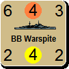
The flags toggle on and off. In actual use, player usually have them off except when setting up unis, or worrying about supply paths. I have discussed the difficulties of using shading overlays several times previously in this thread (and many times in other threads).

The Flyout header was missing in its original implementation. Now it serves a dual purpose: identifying the form, and clicking on it cycles forward through the units when there are more than 9 units in the hex. I used to have the cycle function performed by the label at bottom of the form but that is smaller and difficult to click on, so now it just cycles through the units in reverse (because the entire bottom label cycles backwards, it is easier to click on). The advantage of having the top of the form cycle is that the cursor is placed on/near the top of the form so the distance to move the mouse is much smaller when a player wants to cycle through the units. The top label is also larger to make it easier to position the mouse on the label when you want to cycle forwards.

The font choice was made by a graphics artist who made that decision for clarity on a computer screen. I had no preference in particular (there are thousands of available fonts - my brother is an artist and assures me that is true; you can buy books of fonts). So I just asked the guy doing our graphics to choose one that would be easier(st) to read on a computer screen, especially given the different sizes of text that would be used in the game. He chose Verdana.

I am never offended by suggestions.

By the way, many of the map details can be toggled off if the clutter becomes annoying (e.g., text, rail lines). And some of the smaller text on the map is always removed at zoom levels below 7; for example, only zoom level 7 and 8 show the resource type names (Iron) and historical battlefield names (Anzio).
Steve

Perfection is an elusive goal.
User avatar
nedcorleone1
Posts: 162
Joined: Tue Apr 26, 2011 11:09 am

RE: The maps are dated - fix the terrain

Post by nedcorleone1 »

Thank you very much for the kind response. I was unsure about posting to begin with as to not make anyone think I was being picky.

If the map tiles are stored in a BMP file, it would be easy to load the file into a simple image editor (IrfanView, Photoshop, etc.) and apply a Color Correction filter where you decrease the saturation. I think a subtle decrease could go a long way. This could fix a lot of saturated tiles in one fell swoop. For instance, the desert tiles are just so brightly colored orange. It could be taken down a notch.

I don't think Verdana is a very good font to use for these maps. The big, bold lines with sharp edges only contributes to the overall saturated/busy visuals. Again, I am trying to limit my suggestions to things that are seemingly small and simple to change (or test) that could make a large contribution to overall graphical improvement.

All other points you've replied with are duly noted. I again thank you for your very informative reply.

Shannon V. OKeets
Posts: 22136
Joined: Wed May 18, 2005 11:51 pm
Location: Honolulu, Hawaii
Contact:

RE: The maps are dated - fix the terrain

Post by Shannon V. OKeets »

ORIGINAL: mr_flappypants

Thank you very much for the kind response. I was unsure about posting to begin with as to not make anyone think I was being picky.

If the map tiles are stored in a BMP file, it would be easy to load the file into a simple image editor (IrfanView, Photoshop, etc.) and apply a Color Correction filter where you decrease the saturation. I think a subtle decrease could go a long way. This could fix a lot of saturated tiles in one fell swoop. For instance, the desert tiles are just so brightly colored orange. It could be taken down a notch.

I don't think Verdana is a very good font to use for these maps. The big, bold lines with sharp edges only contributes to the overall saturated/busy visuals. Again, I am trying to limit my suggestions to things that are seemingly small and simple to change (or test) that could make a large contribution to overall graphical improvement.

All other points you've replied with are duly noted. I again thank you for your very informative reply.

You might have a valid point about the map colors. This screenshot is taken ar zoom level 3 in the Decline and Fall scenario - May/June 1944.

But it is pretty late in the day to be messing around with the colors. All the coastal hexes go through a pre-processing sequence to merge the sea area with the land/terrain in the hex. Another major problem is that there are numerous elements that have to be checked in combination.

As you can see in the screenshot, the unit colors vary for each country and we have to be careful that the units don't get 'lost' in the terrain colors. I am especially concerned about players who have trouble differentiating colors. There are several varieties of green in use that were problematical back when I was selecting colors for the map and units. For example, the swamp hexes required several iterations to get the mix of blueish green and greenish blue such that all players could detect the pattern as being 'swamp'. The color for the river lines were also a hassle to get right.

Then there is the consideration of the border line colors if we tamp down the terrain. I expect they would be too 'bold' by comparison. The same would go for all the map labels and icons.

These decisions about colors were made over a period of years, literally. They are 'balanced' at the moment. Touching any one of them would have to be done very carefully.

I also have hundreds of screenshots ready to go to the printer for the Players Manual and Rules as Coded. I need to retake a couple dozen of them but redoing all of them would take a lot of time.

Redoing the font would be tough to do too. The game has 150+ forms with over 1000 components, all of which use Verdana. One of the problems with changing the font is that the amount of room it takes up changes, so the placement of the labels on the map and in the forms would have to be rechecked to make sure they don't overlap or otherwise exceed their allotted footprint. For instance, look at the area around Metz and how all the labels and icons do not obscure each other.

---

I guess my true answer is: these decisions were made back in 2005-2007 and form the fundamental building blocks of the game. It's tough to move stuff that has mountains of decisions looming above it.

Image
Attachments
Map Colors 3 22 2012.jpg
Map Colors 3 22 2012.jpg (843.25 KiB) Viewed 134 times
Steve

Perfection is an elusive goal.
User avatar
nedcorleone1
Posts: 162
Joined: Tue Apr 26, 2011 11:09 am

RE: The maps are dated - fix the terrain

Post by nedcorleone1 »

I did not realize the timeframe we were currently in. That being said, that image looks phenomenal (all my little issues aside). It truly does look good.

User avatar
EUBanana
Posts: 4255
Joined: Tue Sep 30, 2003 3:48 pm
Location: Little England
Contact:

RE: The maps are dated - fix the terrain

Post by EUBanana »

Never played WiF, not a fanboy at all, looks fine to me though?

It is a computerised boardgame after all, it looking like a copy of the board seems fair enough.

Even much more commercialised games, like, I dunno, Magic the Gathering on PC, faithfully reproduce the board (or cards) if its a boardgame copy. Axis and Allies, remember.

If anything could use improvement its the menus and such, it looks like a ten year old business app with the little Windows book help icons and the general "Windows form without even look and feel appearance".

Still, I can live with that I guess if the game is good, and it looks good. HoI3 has quite slick graphics but it doesn't stop the game from sucking. Ditto Civilisation 5. Ditto COTA (ooOOOoooo [:D]).
Image
User avatar
nedcorleone1
Posts: 162
Joined: Tue Apr 26, 2011 11:09 am

RE: The maps are dated - fix the terrain

Post by nedcorleone1 »

ORIGINAL: EUBanana
If anything could use improvement its the menus and such, it looks like a ten year old business app with the little Windows book help icons and the general "Windows form without even look and feel appearance".

Still, I can live with that I guess if the game is good

This. The window frames/borders are busy. The textured window backgrounds are outdated. Things like this only add to an 'aged' look. I understand this is just a byproduct of length of time this game has been in development. However, minor graphical issues aside, the game will stand on its own. The main thing is getting the game completed. That's what we're all looking forward to.
User avatar
Rasputitsa
Posts: 2902
Joined: Sat Jun 30, 2001 8:00 am
Location: Bedfordshire UK
Contact:

RE: The maps are dated - fix the terrain

Post by Rasputitsa »

The map look fine, for the scale and type of game this is, now is not the time to try changing things. [:)]
"In politics stupidity is not a handicap" - Napoleon

“A people which is able to say everything becomes able to do everything” - Napoleon

“Among those who dislike oppression are many who like to oppress" - Napoleon
Post Reply

Return to “World in Flames”